68% reduction in call center load using a user-centered redesign
Reading time: 7 min

Reading time: 7 min

Adobe Photoshop, Adobe XD, Google Forms, Illustrator.
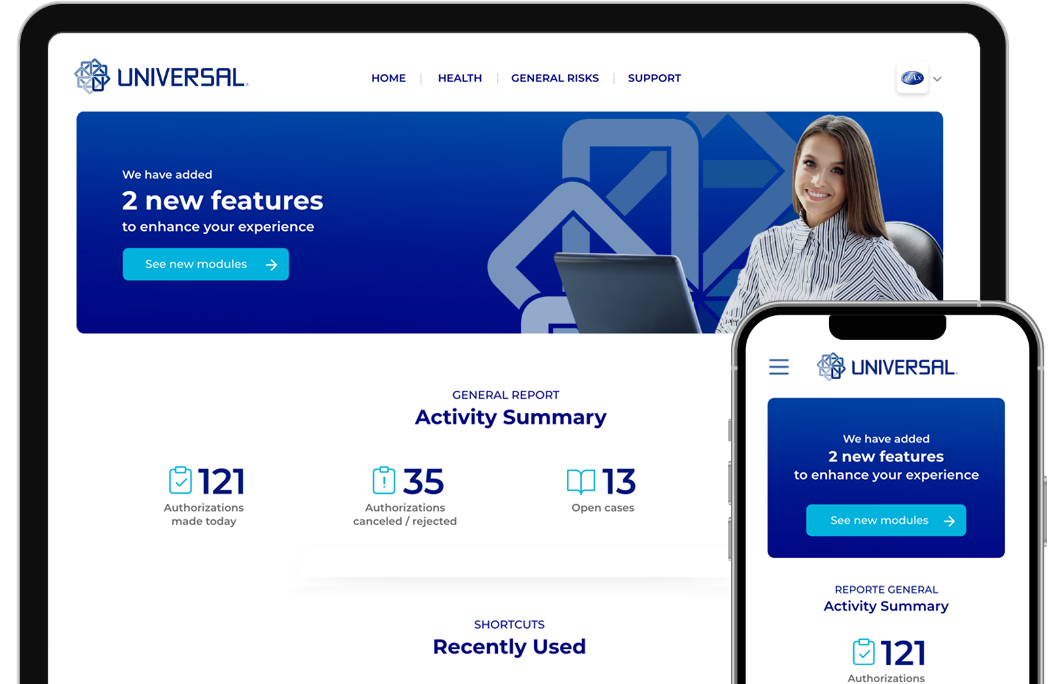
Grupo Universal is a renowned business group with over 55 years of expertise in providing innovative insurance, financial, and service solutions. As a leading insurance company in the Dominican Republic, they sought my assistance in redesigning their customer support platform.
At the beginning of my research, I had limited information: the company aimed to enhance the user experience on the new platform. To clarify concepts, I organized pieces and actions for information collection.
My goal at this stage:I initiated my research with an interview tour of the C Suite to comprehend their challenges and expectations.
Following that, I analyzed the latest Digital Channels department analytics, including active affiliates, most visited sections, average interaction time with modules, and platform access devices.
After gathering all pertinent company information, the next step involved conducting interviews with real users. The following pieces represent the employed methodology.
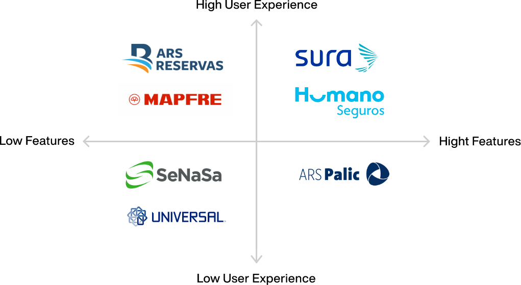
As many users have had the opportunity to use the competitor's platforms, I asked which competitors provide the best experience on their self-service platform.
Then, I presented each competitor with a table comparing their strengths and weakness relative to Universal.

This project's complexity lies in that the portal is for B2B and B2C users. Therefore, I presented the data to the stakeholders with the following pieces:
Nothing is better than knowing and interacting with a product's real user. So these cards were made with real users' information, listing the needs and expectations of the different profiles.

I made a list of the main scenarios each user performs. Then, I selected a representative of each profile and accompanied them in a 1-to-1, executing the task to know the trip with them.
I did a card sorting process with each of the user profiles. Each group has specific needs. So, I recommended showing them only the sections that corresponded to them.
I created seven different navigation structures, one for each type of user. To fit the goals of the web application, I further refined the card sorting results. In addition, some features were re-categorized to make them easier to find.
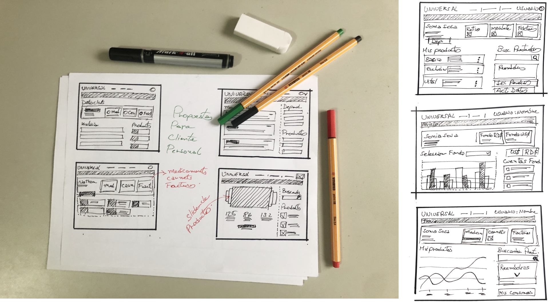
I started with low-fidelity sketches to quickly show visual solutions to the pain points identified during the exploration and definition process.
I identified that the most critical parts of the project were the results tables, long forms, and a summary to show the current step of a task in progress.

These screens represent a personal client with products in the three lines: Local Health, General Risk and Investment Funds: Local Health Screen, General Risks Screen, Investment Funds Screen.
A straightforward way to maintain design consistency over time was missing. So I created a layout system, style libraries, and a build > test > deploy process to apply when the company needs to make updates.
See full prototype